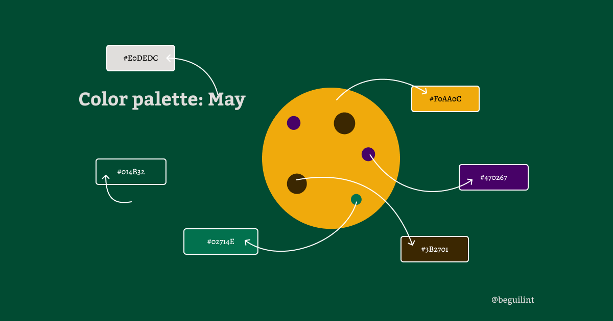
Hey adventurer! May is almost over, and I’m just squeezing in this post before the month slips away. I want to show you how different color palettes can completely change the look and feel of a website’s header. It’s the same layout, but you can see the difference in the way that layout looks simply by changing colors. I think I will make this a series. Let’s see how it goes.
The original color palette
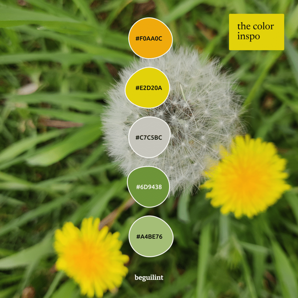
There’s something about dandelions that makes me feel like spring has fully arrived and summer is just around the corner. Maybe it’s because one of the coolest character names in the Witcher series is Dandelion/ Jaskier. I do like the non-translated name more myself, even tho Jaskier means Buttercup in Polish, which is a different flower altogether. But I digress.
The final color palettes
I decided to choose two colors (#F0AA0C & A4BE76) from the original image inspiration and create four color palettes.
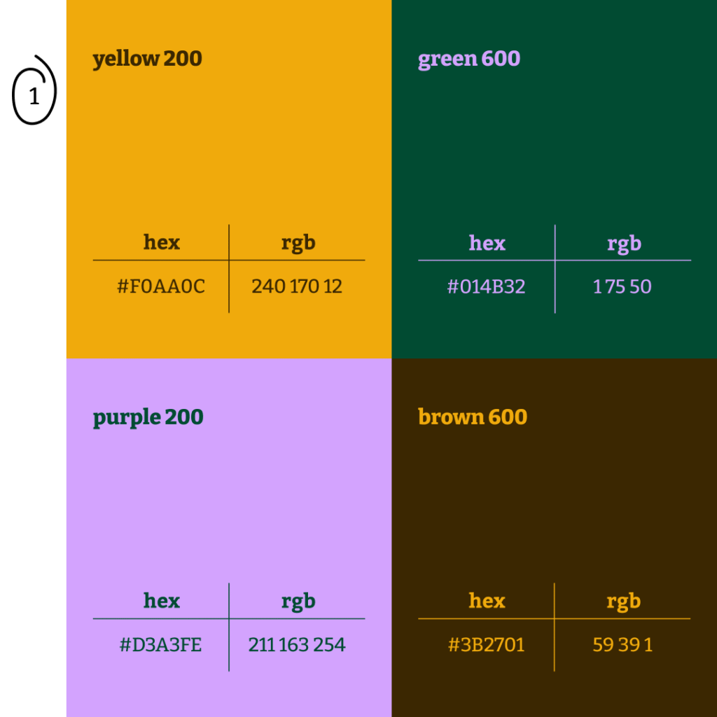
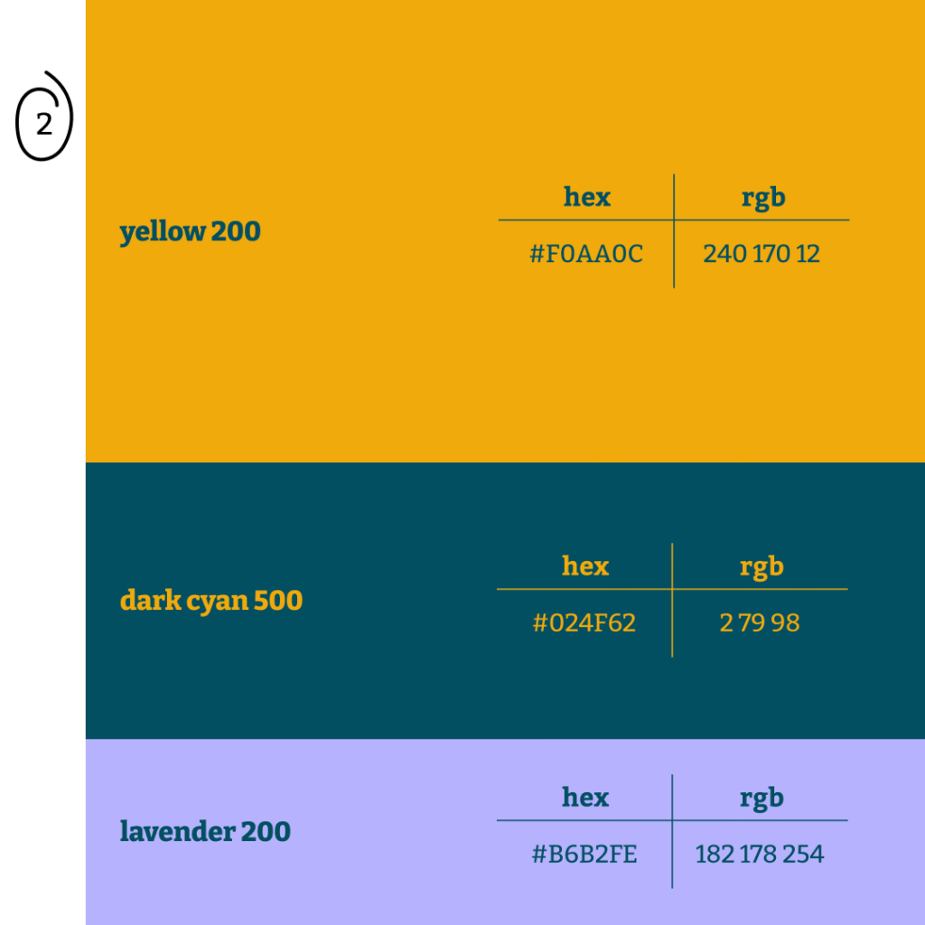
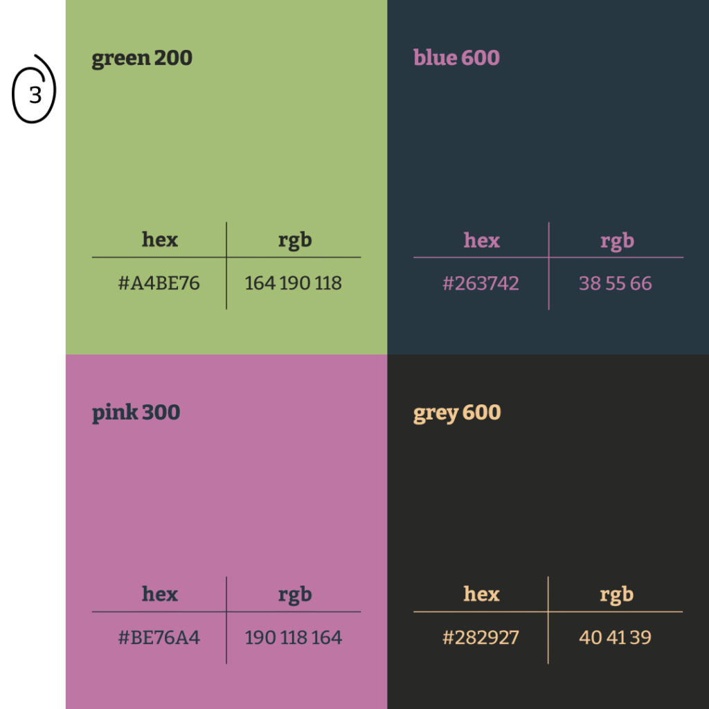
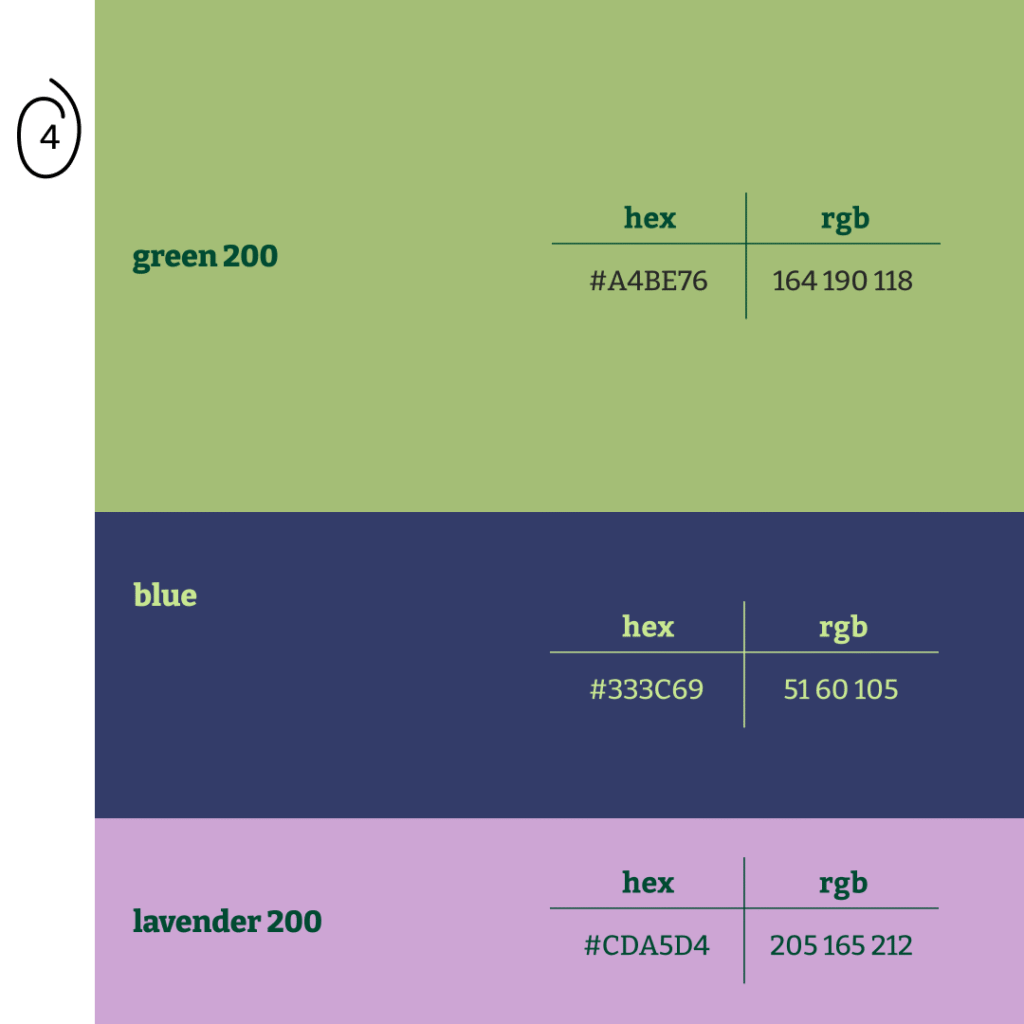
How color palettes can be used
Let’s take a look at four examples of how these color palettes can change the vibe of a website. The same layout, different colors, and different feel.
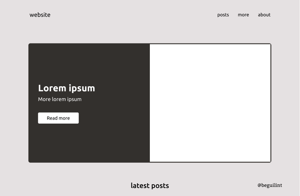
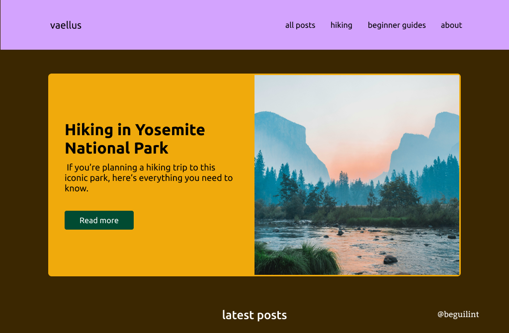
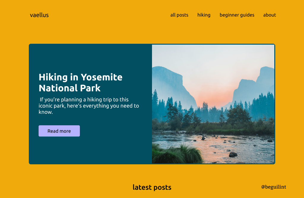
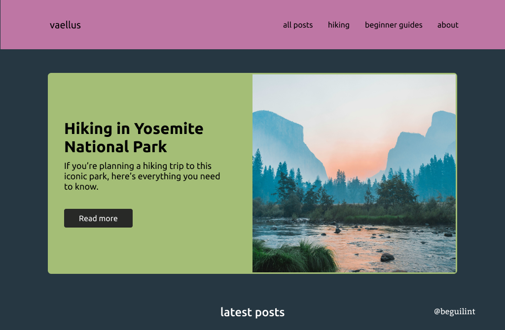
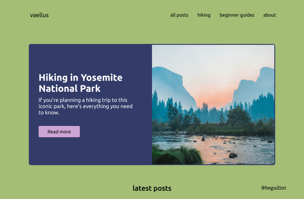
As you can see, a website’s color palette does matter. All of the examples above feel bright and vibrant, even the ones with darker background colors. You don’t even need to read my descriptions to notice how the vibe changes with each palette. The colors speak for themselves.
I hope these examples and this blog post inspire you to experiment with your designs. Now go, adventure awaits!