
Hey adventurer! If you’ve seen my blog posts and illustrations, you already suspect that I love vibrant color palettes. Considering that I have an entire Pinterest board dedicated to them, it’s probably not a surprise.
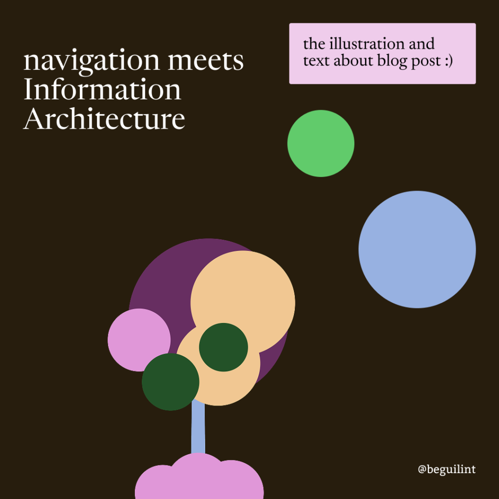
For my latest blog post on navigation and information architecture, I wanted to have some fun, less engineering, and a more artsy vibe. Remember, when you are creating or looking for visuals for your blog, you can experiment and see what works best for you. So, here we go with the colors.
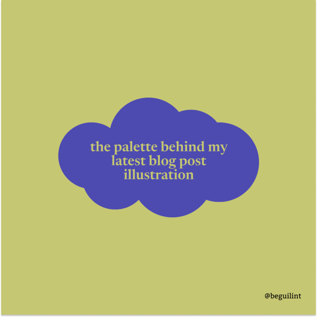
For this post’s illustration, I used green 200 (#C6C772) and purple 500 (#4D4BAF).
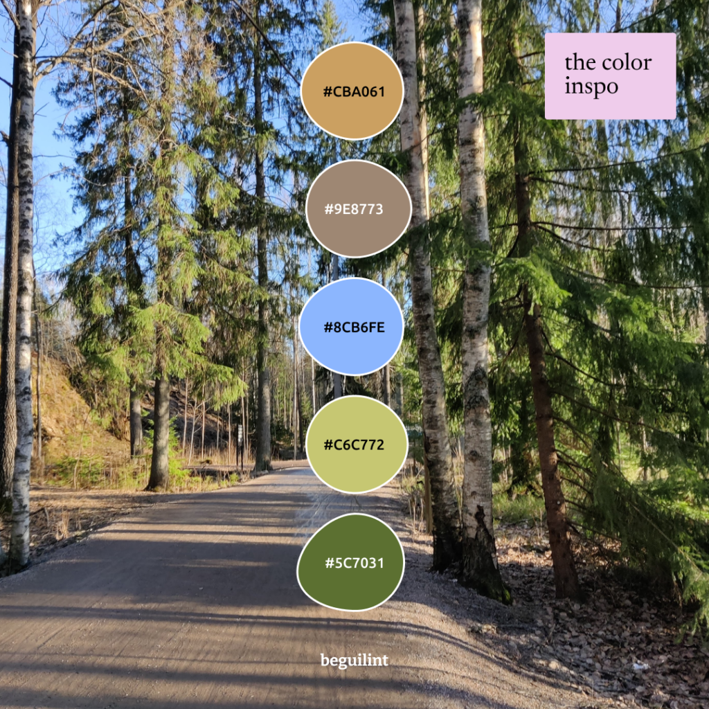
I had a wonderful walk that day. I live in Finland, and not gonna lie, anytime there is sun outside, it’s just wonderful. This palette in Pinterest.
Vibrant colors can create an alien world < 3
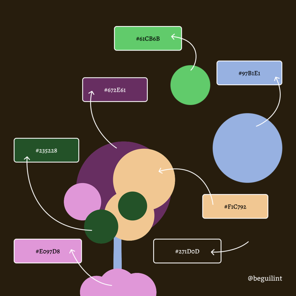
Illustration with all the colors. It looks quite intense here, but below, you will find two color palettes with the colors I used.
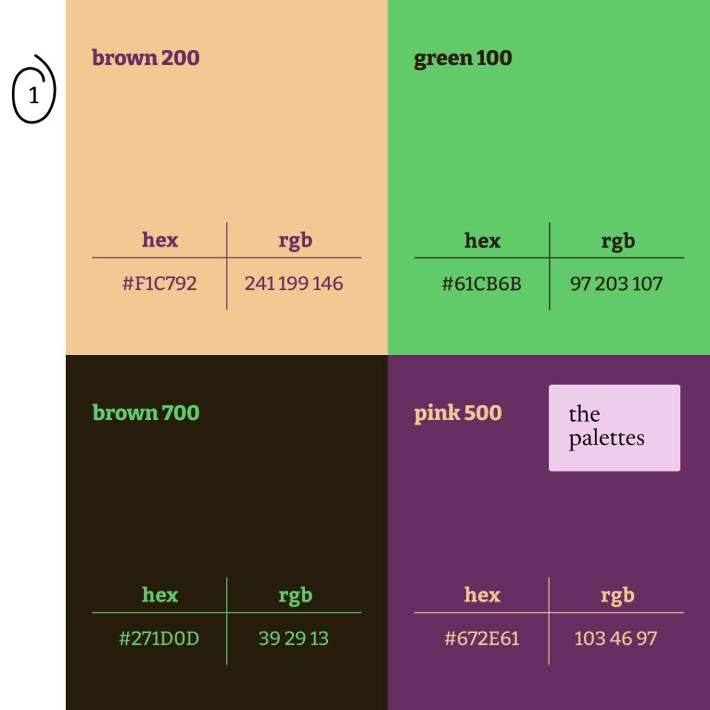
Palette 1
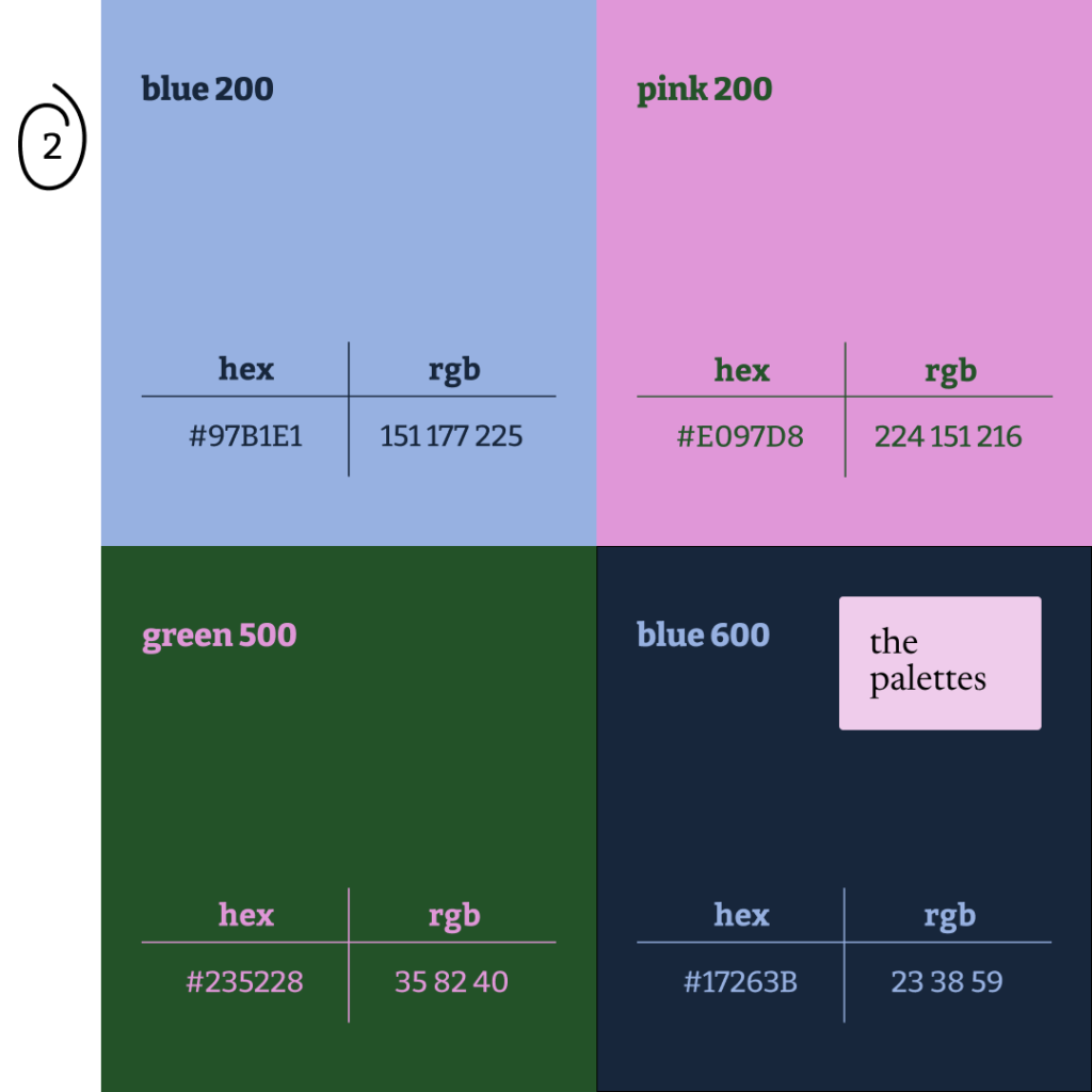
Palette 2
I hope you are inspired for your next quest!